Valspar Paint Colors for Living Room Design Inspiration
Choosing the right Valspar paint colors for your living room can completely change the feel of your home. This guide covers trending palettes, pairing tips, and practical advice to help you pick the perfect shade. Whether you want a cozy neutral or a bold statement, you will find the inspiration you need right here.
Finding the perfect shade for your living room can feel overwhelming. There are so many options, and each one promises to transform your space in a different way. That is exactly why we put together this guide on Valspar paint colors for living room design. Valspar has built a strong reputation for quality paints that come in a wide range of shades. Whether you are refreshing a single wall or repainting the entire room, the right color can make all the difference.
In this article, we will walk you through the best Valspar living room paint colors available right now. We will cover trending palettes, how to pair colors with your furniture, and simple tips to get professional-looking results. By the end, you will feel confident about your choice and ready to start painting.
Key Takeaways
- Warm Neutrals Dominate: Valspar offers warm beige and soft gray tones that work beautifully in any living room setting.
- Bold Accents Make a Statement: Deep blues and greens can turn a plain wall into a stunning focal point.
- Finish Matters: Matte, satin, and semi-gloss finishes each create a different look and feel for your walls.
- Test Before You Commit: Always paint a sample swatch on your wall to see how the color looks in your lighting.
- Pair Colors with Furniture: Your paint choice should complement your living room furniture and accent pieces.
- Trends Change: Stay current with popular palettes while choosing colors that reflect your personal style.
📑 Table of Contents
- Why Valspar Paint Stands Out for Living Rooms
- Top Valspar Paint Colors for Living Rooms
- How to Choose the Right Color for Your Space
- Painting Tips for a Professional Look
- Living Room Color Schemes to Inspire You
- Common Mistakes to Avoid When Choosing Living Room Paint Colors
- Where to Buy Valspar Paint for Your Living Room
- Final Thoughts on Valspar Paint Colors for Living Room
Why Valspar Paint Stands Out for Living Rooms
When it comes to interior paint, not all brands deliver the same quality. Valspar has earned a loyal following for several reasons. Their formulas are durable, easy to apply, and come in a huge variety of shades. This makes them a great choice for any living room project.
Quality and Durability
One of the biggest advantages of Valspar paint is its durability. Living rooms see a lot of traffic. Walls get bumped, scuffed, and marked over time. Valspar paints are designed to resist stains and hold up well against daily wear. This means your walls stay looking fresh for years.
The brand also offers paints with built-in primers. This saves you time and effort because you do not need to prime the walls separately. For a living room makeover, this is a huge benefit. You can go from bare walls to a finished look in fewer steps.
Wide Color Range
Valspar offers one of the widest color selections in the paint industry. You can find everything from soft whites and warm beiges to deep jewel tones and cool grays. This variety means you can match any design style. Whether your taste leans toward modern minimalist or cozy traditional, there is a Valspar shade for you.
The brand also updates its palette each season to reflect current trends. This keeps your options fresh and exciting. If you are looking for something on-trend, Valspar frequently releases new collections inspired by fashion and design movements.
Top Valspar Paint Colors for Living Rooms
Now let us get into the fun part. Here are some of the best Valspar paint colors for living room spaces. Each of these shades works well in different settings and design styles.
Warm Neutrals
Neutral tones are timeless. They create a calm and inviting atmosphere that works for almost any decor style. Valspar has several excellent neutral options.
- White Tie: A clean, bright white that makes a room feel open and airy. It pairs well with almost any furniture color.
- Accessible Beige: A warm, soft beige that adds coziness without making the room feel heavy. This is a popular choice for traditional and transitional designs.
- Silver Mist: A light gray with cool undertones. It works beautifully in modern and Scandinavian-inspired living rooms.
- Newburyport Gray: A medium gray with warm hints. It adds depth and sophistication without feeling cold.
Bold and Deep Tones
If you want to make a statement, bold colors are the way to go. A deep wall color can become the centerpiece of your living room. It adds personality and drama in a way that neutral shades simply cannot.
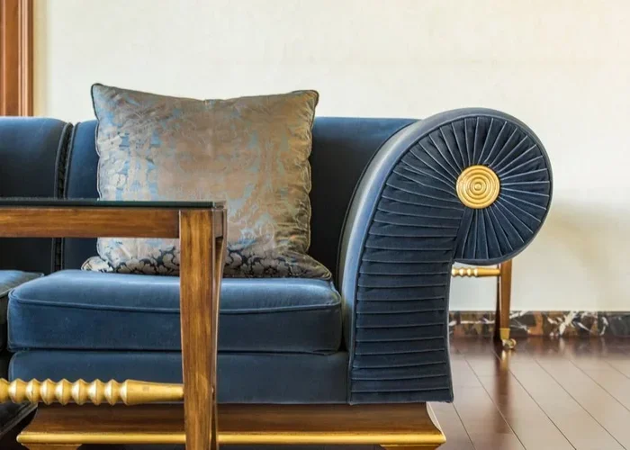
- Navy Blue: A rich, deep blue that creates a sophisticated and moody feel. It pairs beautifully with gold or brass accents.
- Forest Green: A dark, earthy green that brings a sense of nature indoors. This color works well in bohemian and eclectic styles.
- Charcoal: A near-black gray that adds drama and elegance. Use it on an accent wall for a modern, bold look.
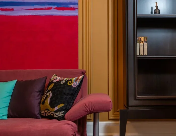
- Burgundy: A deep, warm red that feels luxurious and inviting. It is perfect for creating a cozy reading nook atmosphere.
Soft Pastels and Light Shades
Light colors can make a small living room feel bigger and brighter. They also create a soft, relaxing vibe that is perfect for unwinding.
- Powder Blue: A gentle, soothing blue that adds a coastal feel to any room.
- Soft Sage: A muted green that feels fresh and natural. It works beautifully in farmhouse and cottage-style interiors.
- Blush Pink: A subtle, warm pink that adds femininity and warmth without being overwhelming.
- Pale Yellow: A cheerful, light yellow that brings sunshine into your living room even on cloudy days.
How to Choose the Right Color for Your Space
Picking a paint color is more than just choosing one you like on a swatch. The way a color looks on your wall depends on many factors. Let us break down the key considerations.
Consider Your Lighting
Lighting has a huge impact on how a paint color appears. Rooms with lots of natural light can handle darker, bolder colors. North-facing rooms with less light tend to look better with lighter, warmer shades.
Before you commit, paint a large swatch on your wall. Observe it at different times of the day. Watch how the color changes in morning light versus evening light. This simple step can save you from a costly mistake.
Match Your Furniture and Decor
Your paint color should work with the furniture and decor you already have. If you have dark wood furniture, lighter wall colors can balance the room. If your furniture is light-colored, you have more freedom to go darker on the walls.
Think about your accent pieces too. Throw pillows, rugs, curtains, and artwork all play a role in the overall color story. Choose a paint color that complements these elements rather than competing with them. For more ideas on pairing paint with decor, check out our guide on accent pieces for living room design.
Think About the Mood You Want
Colors affect our emotions. Cool tones like blue and green tend to feel calming and relaxing. Warm tones like beige, yellow, and terracotta create a cozy and energizing feel. Bold colors like deep red or navy add drama and sophistication.
Think about how you use your living room. Is it a space for relaxing and unwinding? Or is it where you entertain guests and want something eye-catching? Your answer will guide your color choice.
Painting Tips for a Professional Look
Even the best paint color will look bad if the application is sloppy. Here are some practical tips to help you achieve a flawless finish.
Prep Your Walls Properly
Preparation is the most important step in any painting project. Start by cleaning the walls to remove dust and dirt. Fill any holes or cracks with spackle. Sand the surface smooth once it dries. This ensures the paint adheres evenly and looks smooth when finished.
Use the Right Tools
Invest in good quality brushes and rollers. A high-quality roller gives a smoother finish and covers more area quickly. Use angled brushes for cutting in along edges and corners. Painter’s tape is your best friend for clean lines around trim and ceilings.
Apply Multiple Thin Coats
Instead of one thick coat, apply two or three thin coats. Thin coats dry more evenly and prevent drips and streaks. Allow each coat to dry completely before applying the next. This patience pays off with a polished, professional-looking result.
Choose the Right Finish
The finish of your paint affects both the look and the durability. Here is a quick comparison of common Valspar finishes for living rooms:
- Matte: No shine. Hides wall imperfections well but is harder to clean. Best for low-traffic areas or ceilings.
- Eggshell: A subtle, soft shine. Easy to clean and looks elegant. A popular choice for living room walls.
- Satin: A smooth, velvety shine. More durable and easier to wipe down than eggshell.
- Semi-Gloss: A noticeable shine. Very durable and easy to clean. Great for trim, doors, and high-touch surfaces.
For most living rooms, eggshell or satin finishes work best. They offer a nice balance of look and practicality.
Living Room Color Schemes to Inspire You
Sometimes the best way to choose a color is to see how it works in a complete scheme. Here are some popular living room color combinations using Valspar paints.
Modern Minimalist
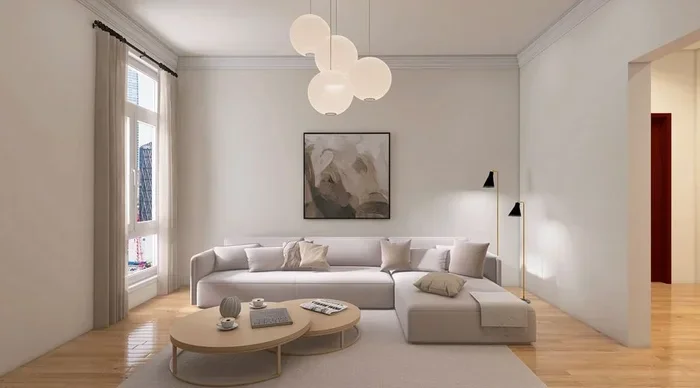
This scheme relies on clean lines and a restrained color palette. Use White Tie on the walls for a bright, open feel. Pair it with charcoal or black furniture and add texture through natural materials like wood and linen. A single bold accent piece in deep navy or black ties the room together.
Cozy Traditional
Warm and inviting is the name of the game here. Accessible Beige on the walls creates a welcoming backdrop. Add rich wood furniture, plush fabrics, and warm-toned accent pieces. For more ideas on creating a cozy atmosphere, explore our collection of aesthetic living room ideas.
Bold and Eclectic
Go big with a deep color like Forest Green or Navy Blue on one accent wall. Keep the other walls lighter to balance the intensity. Mix patterns, textures, and colors in your furniture and decor. This approach works best in larger living rooms where bold colors do not feel overwhelming.
Fresh and Airy
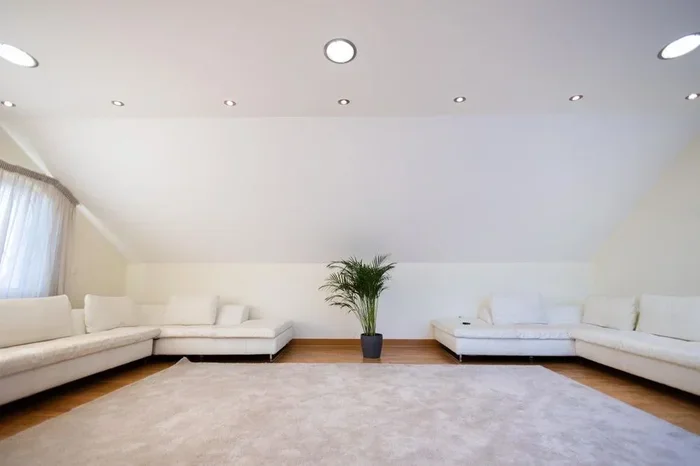
Perfect for smaller spaces or rooms that lack natural light. Use Silver Mist or Soft Sage on the walls to create a light, refreshing feel. Pair with white or light wood furniture and keep decor minimal. This scheme makes a room feel open and calm.
Common Mistakes to Avoid When Choosing Living Room Paint Colors
Even experienced homeowners make mistakes when choosing paint colors. Here are some common pitfalls to watch out for.
- Choosing a color based only on a small swatch: A small paint chip looks very different from a full wall. Always test a large area before committing.
- Ignoring the undertone: Every color has an undertone of blue, yellow, pink, or green. Make sure the undertone matches your other elements.
- Following trends blindly: Trends come and go. Choose a color you genuinely love and that fits your personal style.
- Forgetting about the ceiling: The ceiling color affects the overall feel of the room. A white ceiling makes a room feel taller, while a colored ceiling adds intimacy.
- Not considering flow between rooms: If your living room opens to other spaces, consider how the colors will work together.
Avoiding these mistakes will save you time, money, and frustration. Take your time, do your research, and trust your instincts.
Where to Buy Valspar Paint for Your Living Room
Valspar paint is widely available at most major home improvement stores. You can also find it at specialty paint retailers and online. When shopping, look for Valspar’s interior paint collections specifically designed for living spaces. These collections often include curated palettes and finish recommendations.
Many stores also offer Valspar color matching services. If you have a specific color in mind from a fabric, rug, or piece of art, bring in a sample and they can mix a custom match. This is a great way to ensure your walls perfectly complement your existing decor.
For more tips on planning your living room layout alongside your paint choice, visit our article on how to place furniture in living room. And for styling ideas once your walls are painted, check out our guide on how to style a side table in living room.
Final Thoughts on Valspar Paint Colors for Living Room
Choosing the right Valspar paint colors for living room spaces is one of the most impactful decisions you can make for your home. The right color sets the mood, ties together your furniture and decor, and makes your space feel truly yours. With Valspar’s wide selection of quality paints, you have everything you need to create a beautiful living room.
Start by considering your lighting, furniture, and the mood you want to create. Test your top choices on the wall before committing. Take your time and enjoy the process. Painting your living room is one of the most rewarding DIY projects you can tackle, and the results will be something you enjoy every day.
Whether you go with a calming neutral, a bold accent color, or a soft pastel, the key is to choose something that makes you happy. Your living room is your sanctuary. Make it a place you love to spend time in.
Frequently Asked Questions
What are the most popular Valspar paint colors for living rooms?
The most popular Valspar living room colors include White Tie for bright whites, Accessible Beige for warm neutrals, and Navy Blue for bold accent walls. Silver Mist and Newburyport Gray are also top picks for modern interiors. These shades are versatile and work with a wide range of decor styles.
How do I know if a Valspar paint color will work in my living room?
The best way to test a color is to paint a large swatch on your wall and observe it in different lighting throughout the day. Consider your furniture colors, flooring, and natural light. A color that looks perfect in the store may look very different on your walls, so testing is essential.
Which Valspar paint finish is best for living room walls?
Eggshell and satin finishes are the most popular choices for living room walls. They offer a subtle sheen that looks elegant, are easy to clean, and hide minor imperfections. Avoid matte finishes on walls in high-traffic areas because they are harder to touch up.
Can I use bold Valspar colors in a small living room?
Yes, but use them strategically. Paint one accent wall in a bold color like Forest Green or Charcoal while keeping the other walls light. This approach adds depth and personality without making a small room feel cramped. Pair bold walls with light furniture and plenty of natural light.
How many coats of Valspar paint do I need for a living room?
Most Valspar paints require two to three coats for full, even coverage. If you are painting over a dark color with a lighter one, you may need an additional coat. Always let each coat dry completely before applying the next for the best results.
Where can I find Valspar paint color swatches for my living room?
You can find Valspar paint swatches at most home improvement stores, paint retailers, and online at Valspar’s official website. Many stores also offer free color consultations. You can also order free sample pots to test colors in your living room before committing to a full purchase.