Navy Blue and Burnt Orange Living Room Makeover Tips
A navy blue and burnt orange living room brings together warm and cool tones to create a space that feels both bold and inviting. This color pairing works because navy provides a calm, grounding base while burnt orange adds energy and personality. You can use these colors on walls, furniture, throw pillows, rugs, and decorative accents to build a cohesive look. Whether you prefer a modern aesthetic or a more traditional vibe, this combination adapts beautifully to any style. Keep reading for practical tips, color ratios, and design ideas that make the navy blue and burnt orange living room trend easy to pull off.
There is something magical about a navy blue and burnt orange living room. These two colors sit opposite each other on the color wheel, which means they naturally complement each other. The deep, moody navy creates a sense of calm and sophistication, while the warm burnt orange brings energy and a cozy feeling. Together, they turn a plain room into a space that feels intentional and designed with care.
If you have been staring at your living room wondering how to give it a fresh look, this color combination is a fantastic place to start. It works for small apartments and large family rooms alike. You do not need to be a professional designer to make it work either. With a few simple steps, you can refresh your space and create a room that feels both stylish and comfortable. Let us walk through everything you need to know.
Key Takeaways
- Color Balance Matters: Use navy as your dominant base and burnt orange as an accent to keep the room harmonious.
- Start with Small Touches: Throw pillows, blankets, and curtains are the easiest way to introduce the color combo.
- Choose the Right Furniture: Neutral sofas work perfectly as a backdrop for navy and orange decor elements.
- Add Texture for Depth: Mix materials like velvet, linen, and wood to make the color palette feel rich and layered.
- Lighting Changes Everything: Warm lighting enhances burnt orange tones and softens the intensity of navy.
- Follow the 60-30-10 Rule: 60% neutral base, 30% navy, and 10% burnt orange keeps the room balanced and visually appealing.
📑 Table of Contents
- Why Navy Blue and Burnt Orange Work So Well Together
- How to Choose the Right Shades of Navy and Burnt Orange
- The 60-30-10 Rule for a Balanced Living Room
- Furniture Choices That Complement the Color Scheme
- Decor and Accessories That Bring the Room Together
- Common Mistakes to Avoid
- Bringing It All Together
Why Navy Blue and Burnt Orange Work So Well Together
The secret behind this pairing lies in color theory. Navy blue is a cool, dark tone that acts as a natural anchor for any room. Burnt orange is a warm, earthy hue that adds depth and visual interest. When you place them side by side, they create a striking contrast without clashing.
This combination also works because it mirrors nature. Think about a sunset over the ocean. The deep blue water meets the warm orange glow of the setting sun. Your living room can capture that same beautiful balance. The result is a space that feels both dramatic and relaxing at the same time.
Another reason this pairing shines is versatility. You can lean into a modern look with clean lines and minimal decor. Or you can go for a more eclectic vibe with layered textures and mixed patterns. The navy blue and burnt orange living room scheme adapts to your personal style with ease.
The Psychology Behind These Colors
Colors affect how we feel in a space. Navy blue is known to promote calmness and focus. It makes a room feel grounded and serene. Burnt orange, on the other hand, sparks creativity and warmth. It adds a welcoming energy that makes guests feel at home.
When you combine these two, you get a room that is both peaceful and inviting. That is a rare and valuable combination in any living space. This is why so many homeowners are choosing this color palette living room approach for their living room makeover projects.
How to Choose the Right Shades of Navy and Burnt Orange
Not all navy blues are the same, and neither are all burnt oranges. Choosing the right shades makes a big difference in how your room looks and feels. Here is what to keep in mind.
For navy blue, look for shades that lean slightly muted rather than bright. A deep, matte navy works best as a primary color. Avoid anything that looks too purple or too black, as it can throw off the balance. You want a navy that feels rich but still warm.
For burnt orange, choose a tone that has brown undertones. This keeps the color grounded and earthy. A bright tangerine orange will feel too intense and can overwhelm the space. The goal is a warm, subdued orange that complements the navy without competing with it.
Testing Colors Before You Commit
Always buy sample pots of paint before committing to a wall color. Paint a small section on your wall and observe it at different times of day. Natural light and artificial light change how colors appear. What looks perfect in the morning might feel different in the evening.
You can also test fabric swatches for your accent colors living room pieces. Hold them up against your wall color and furniture to see how they interact. This simple step saves time, money, and regret later on.
The 60-30-10 Rule for a Balanced Living Room
Interior designers rely on the 60-30-10 rule to create balanced color schemes. Here is how it applies to your navy blue and burnt orange living room:
- 60% Neutral Base: This is your dominant color. Think white, cream, beige, or light gray walls and large furniture pieces.
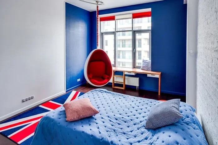
- 30% Navy Blue: Use this for accent walls, sofas, curtains, or large rugs. It becomes the main color after your neutral base.
- 10% Burnt Orange: This is your pop of color. Use it for throw pillows, blankets, decorative objects, and small accessories.
Following this rule prevents the room from feeling too dark or too overwhelming. The neutral base gives your eyes a place to rest, while the navy and orange add visual interest and personality. It is a simple but powerful approach to living room color scheme design.
Adjusting the Rule for Your Space
If your living room gets plenty of natural light, you can push the navy closer to 40%. Bright rooms handle darker colors better. If your space is on the smaller side or lacks windows, keep the navy at 30% or even 25% to avoid making the room feel cramped.
For rooms with very little natural light, consider using a lighter neutral base like soft cream or pale gray. This helps reflect whatever light is available and keeps the space feeling open. The warm and cool tones balance still works even with slight adjustments.
Furniture Choices That Complement the Color Scheme
Your furniture choices set the foundation for how the colors come together in the room. The right pieces make the navy blue and burnt orange living room feel intentional and polished.
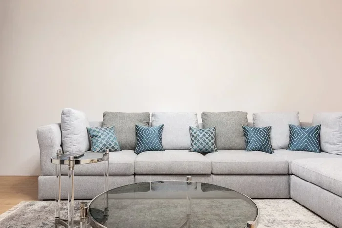
A neutral-toned sofa is your best friend here. Think beige, cream, light gray, or soft white. This gives you a clean canvas to build on. You can then add navy and burnt orange through smaller furniture pieces and accessories. A navy armchair or a burnt orange accent ottoman works beautifully as a secondary piece.
Wood Furniture and Tones
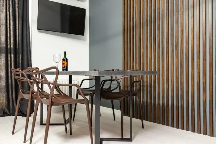
Wood furniture adds warmth to any room with a navy and orange palette. Warm wood tones like oak, walnut, or cherry pair naturally with burnt orange. They also soften the boldness of navy, creating a cozy and grounded feel.
If your existing furniture is darker, consider adding lighter wood pieces like a coffee table or side table. This creates visual variety and keeps the room from feeling too heavy. The mix of light and dark wood also adds texture and dimension.
When selecting new pieces, think about how they fit into your overall living room design ideas. A simple way to approach this is to choose furniture that works with multiple styles. Clean-lined pieces in neutral tones give you flexibility to change accessories over time without replacing the furniture.
Decor and Accessories That Bring the Room Together
This is where the magic really happens. Accessories are the easiest and most affordable way to introduce your navy blue and burnt orange living room color scheme. They also let you experiment before committing to bigger changes.
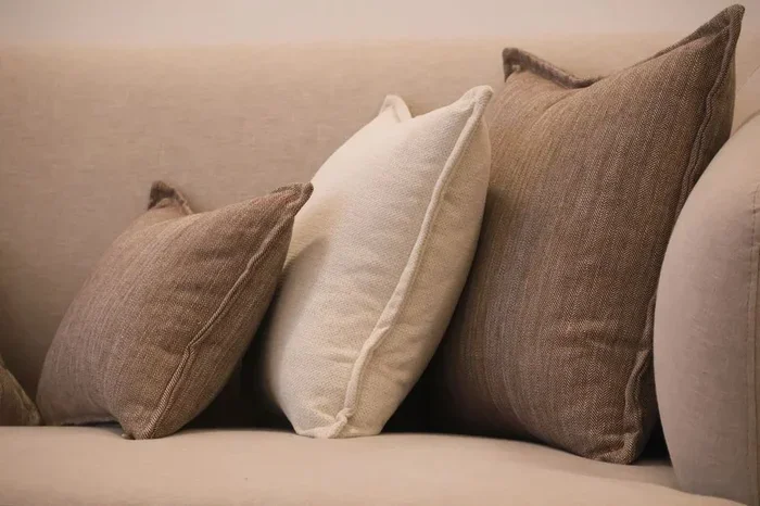
Start with throw pillows and blankets. These are the quickest way to add both colors to your sofa. Mix navy pillows with burnt orange ones, and add a few in neutral tones to tie everything together. Textured fabrics like velvet, boucle, or linen add an extra layer of visual interest.
Rugs and Curtains
A area rug can anchor the entire room. Look for rugs that feature both navy and burnt orange patterns, or choose a neutral rug with subtle hints of both colors. The rug should complement your furniture and wall color without overpowering the space.
Curtains are another great way to introduce color. Navy curtains create a dramatic focal point on one wall, while burnt orange curtains add a warm glow. If you prefer a subtler approach, choose curtains in a neutral tone with a hint of navy or orange in the fabric.
Wall Art and Decorative Objects
Artwork is a powerful tool for tying a color scheme together. Look for pieces that feature navy, burnt orange, and neutral tones. Abstract prints work especially well because they allow you to incorporate both colors in a non-literal way.
Decorative objects like vases, candles, and books also contribute to the overall feel. Place burnt orange candles on a navy tray, or stack books in both colors on a coffee table. These small details make the room feel curated and thoughtful.
For more ideas on selecting the perfect pieces, check out our guide on accent pieces for your living room. It covers how to choose accessories that elevate your space.
Common Mistakes to Avoid
Even with a great color scheme, some missteps can throw off the entire look. Here are the most common mistakes people make with a navy blue and burnt orange living room and how to avoid them.
- Using Too Much Navy: Navy is a dark, heavy color. If you use it on too many surfaces, the room can feel closed in and gloomy. Stick to the 60-30-10 rule and let the neutral base do the heavy lifting.
- Skipping the Neutral Base: Some people skip the neutral colors entirely and go straight for navy and orange. This creates a jarring look. Neutrals give the eye a place to rest and make the bold colors feel intentional.
- Ignoring Lighting: Lighting affects how colors appear in a room. Cool fluorescent bulbs can make navy look harsh and orange look muddy. Warm LED bulbs bring out the best in both colors.
- Forgetting About Texture: A room with only flat colors can feel flat. Mix textures like velvet, wood, metal, and woven fabrics to add depth and make the space feel inviting.
- Over-Matching: You do not need every item to match perfectly. A little variety in shades and textures keeps the room feeling natural and lived-in.
Quick Tips to Keep in Mind
Take a step back and look at the room from the doorway before you finalize any decisions. Does it feel balanced? Is there a focal point? Are the colors working together or competing? These simple checks help you catch issues early.
Also, remember that design is personal. These tips are guidelines, not strict rules. If a particular shade of navy or orange speaks to you, trust your instinct. Your living room should reflect who you are and how you want to feel at home.
For additional inspiration on arranging your furniture to complement the new color scheme, explore our article on how to arrange sofa and loveseat in living room. It offers practical layout ideas that work with bold color palettes.
Bringing It All Together
A navy blue and burnt orange living room is more than just a trend. It is a timeless combination that brings warmth, sophistication, and personality into any home. By following the 60-30-10 rule, choosing the right shades, and layering in accessories thoughtfully, you can create a space that feels both cohesive and dynamic.
Start small if you feel unsure. Add a few navy throw pillows and a burnt orange blanket to your existing sofa. See how the room feels before making bigger changes. Design is a journey, and the best rooms evolve over time. Let your space grow with you, and do not be afraid to experiment.
The beauty of this color combination is that it works in almost any setting. Whether your style is modern, bohemian, traditional, or eclectic, navy and burnt orange find a way to fit. Trust the process, enjoy the creative journey, and soon you will have a living room that you truly love spending time in.
Looking for more design inspiration? Our article on aesthetic living room ideas is packed with creative suggestions for every style and budget.
Frequently Asked Questions
What is the best neutral color to pair with navy blue and burnt orange?
Soft cream, warm beige, and light gray are the best neutral choices. They balance the boldness of navy and orange without competing for attention. These neutrals also work well as wall colors and large furniture pieces.
Can I use navy blue and burnt orange in a small living room?
Absolutely. In small rooms, use navy as an accent rather than the dominant color. Stick to lighter neutrals for walls and large furniture. Add navy and burnt orange through smaller accessories like pillows, art, and rugs to keep the space feeling open.
What lighting works best for a navy and burnt orange living room?
Warm white LED bulbs create the best atmosphere for this color combo. They enhance the warmth of burnt orange and soften the depth of navy. Avoid cool or blue-toned bulbs, as they can make both colors look dull and uninviting.
How do I prevent my navy blue and burnt orange living room from feeling too dark?
Keep the majority of the room in neutral tones. Use mirrors to reflect light and make the space feel brighter. Choose lighter wood furniture and add plenty of white or cream accessories. Good natural light also helps keep the room from feeling heavy.
What fabrics work best for a navy and burnt orange color scheme?
Velvet, linen, and cotton are excellent choices. Velvet adds a luxurious feel that complements both colors beautifully. Linen brings a relaxed, casual texture, and cotton offers durability and easy maintenance for high-use areas like sofas and throw pillows.
Is burnt orange still in style for living room decor?
Yes, burnt orange remains a popular choice in interior design. It works well in both contemporary and traditional settings. Its warm, earthy tone adds coziness and personality without feeling outdated. Design trends come and go, but burnt orange has staying power because it complements so many other colors.