Sherwin Williams Living Room Colors to Transform Your Home
Sherwin Williams living room colors offer endless possibilities to refresh and transform your home. Whether you prefer neutral living room tones or bold wall colors, the right paint can completely change the feel of your space. In this guide, we explore the top palettes, trends, and tips to help you pick the perfect living room color palette for your home.
There is something truly magical about Sherwin Williams living room colors. A fresh coat of paint can turn a dull, forgotten space into the heart of your home. Whether you are moving into a new place or simply tired of the same old walls, choosing the right color is the single biggest decision you can make for your living room.
The problem? With hundreds of options on the Sherwin Williams color cards, the choices can feel overwhelming. Do you go with a neutral living room color that never goes out of style? Or do you make a statement with bold living room paint that reflects your personality? This guide breaks it all down for you.
We will walk through the best Sherwin Williams shades, explain how lighting affects your choice, and share practical tips you can use right away. By the end, you will feel confident picking the perfect living room wall colors for your home.
Key Takeaways
- Warm neutrals dominate: Colors like Accessible Beige and Alabaster remain top choices for cozy, inviting living rooms.
- Bold accents add personality: A single accent wall in deep blue or emerald green can completely refresh a room.
- Lighting matters enormously: Always test paint swatches in your actual living room lighting before committing.
- Pair colors with furniture: Your living room color palette should complement your existing furniture and decor style.
- Small tips create big impact: Trim color, ceiling hue, and accent pieces all influence how your walls look and feel.
- Start with a sample: Painting a large swatch on your wall saves time, money, and regret later.
📑 Table of Contents
- Why Sherwin Williams Is a Top Choice for Living Room Paint
- Top Sherwin Williams Living Room Colors to Consider
- How to Choose the Right Living Room Color Palette
- The Role of Lighting in Living Room Colors
- Pairing Sherwin Williams Colors With Your Living Room Style
- Common Mistakes to Avoid When Choosing Living Room Colors
- Expert Tips for a Stunning Living Room Refresh
- Conclusion
Why Sherwin Williams Is a Top Choice for Living Room Paint
Sherwin Williams has earned its reputation as one of the most trusted paint brands in the country. Their color range is vast, their quality is consistent, and their formula covers well in fewer coats. For homeowners who want reliable results, Sherwin Williams living room colors deliver on every level.
Quality You Can Count On
Sherwin Williams paints are known for their durability. A good living room paint needs to handle kids, pets, and daily life without showing every mark. Their interior formulas are designed to resist scrubbing, fading, and yellowing over time. This means your living room color palette stays fresh for years.
An Incredible Color Range
One reason so many people choose Sherwin Williams is the sheer variety. From soft whites to deep charcoal, there is a shade for every taste. Their color cards are organized beautifully, making it easy to browse by mood, temperature, or style. Whether you want cool living room tones or warm living room hues, you will find exactly what you need.
Helpful Tools and Resources
Sherwin Williams offers tools that make color selection much easier. Their ColorSnap app lets you visualize how a color looks in your space. You can also pick up physical paint samples and paint large swatches directly on your walls. This step is one of the smartest things you can do before committing to a full room makeover.
Top Sherwin Williams Living Room Colors to Consider
Choosing a color is deeply personal, but some shades stand out as favorites among designers and homeowners alike. Here are some of the most popular Sherwin Williams living room colors that work beautifully in real homes.
Accessible Beige
Accessible Beige is a warm, inviting neutral that works in almost any living room. It pairs well with wood furniture, white trim, and colorful accent pieces for living room decor. This shade is perfect if you want a cozy living room color that still feels modern and clean.
Alabaster
Alabaster is a creamy white with warm undertones. Unlike stark whites, it adds softness without feeling boring. Many homeowners use Alabaster on walls and trim for a seamless, light and airy living room feel. It is one of the best neutral living room colors available.
Naval
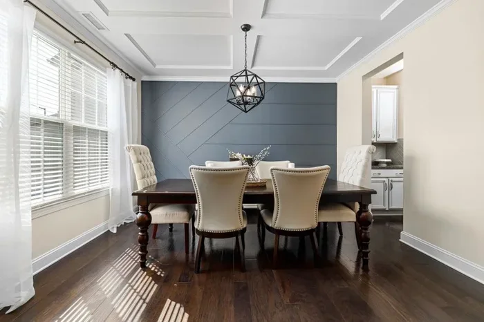
Naval is a deep, moody blue that makes a stunning accent wall. It brings sophistication and depth to a space. Pair Naval with brass fixtures and white furniture for a classic look, or with natural wood for a more relaxed vibe. This is one of the most popular bold living room paint choices.
Evergreen Fog
Evergreen Fog is a soft, muted green that feels calming and fresh. It works beautifully in living rooms that get good natural light. This shade is perfect for creating a restful living room atmosphere that still feels stylish and current.
Worldly Gray
Worldly Gray is a warm gray with subtle beige undertones. It avoids the cold, sterile feel that some grays can have. This color is incredibly versatile and pairs well with almost any furniture style, from mid-century modern to traditional.
Pepper Pot
Pepper Pot is a rich, deep gray-green that adds drama without being too dark. It works well as an accent wall color in larger living rooms. For smaller spaces, use it sparingly on a bookshelf or behind a sofa to add depth and interest.
How to Choose the Right Living Room Color Palette
Picking colors is more than just choosing a favorite shade. Your living room color palette should work with your furniture, your lighting, and your personal style. Here is how to approach the decision with confidence.
Start With Your Furniture and Decor
Look at the pieces you already have in your living room. What colors dominate your sofa, rugs, and curtains? Your wall color should complement these elements, not compete with them. If your furniture is neutral, you have more freedom to go bold with your living room wall colors. If your furniture is colorful, stick with a quieter shade on the walls.
Consider the Mood You Want
Colors affect how we feel in a space. Warm living room tones like beige, cream, and soft orange create a cozy, inviting atmosphere. Cool living room tones like gray, blue, and green feel calm and refreshing. Think about how you want to feel when you walk into your living room every day.
Test Before You Commit
This is the most important step in the entire process. Buy a sample of your top choice and paint a large section of your wall. Observe it at different times of day. Watch how it looks in the morning light, afternoon sun, and evening lamplight. A color that looks perfect in the store might feel completely different under your living room lighting.
Think About Flow Between Rooms
If your living room opens to a hallway, dining room, or kitchen, think about how the colors will connect. You do not need every room to match, but there should be a visual thread that ties the spaces together. A consistent trim color or a shared accent tone works wonders for creating flow.
The Role of Lighting in Living Room Colors
Lighting can make or break your Sherwin Williams living room colors. The same shade can look completely different under warm bulbs versus cool bulbs, or in a bright room versus a dim one. Understanding this will save you from costly mistakes.
Natural Light
Rooms with large windows and plenty of natural light can handle deeper, richer colors. Bold living room paint shades like Naval or Pepper Pot thrive in sunny spaces. In contrast, darker rooms benefit from lighter, brighter neutral living room colors that reflect whatever light is available.
Artificial Light
The type of bulbs you use changes how your walls look. Warm white bulbs bring out the warmth in beige and cream tones. Cool white bulbs can make gray shades feel crisp and modern. LED bulbs with a high color rendering index (CRI) show colors more accurately, which helps you see your true living room color palette.
Quick Tips for Testing Lighting
- Paint a large swatch and observe it throughout the day.
- Turn on your regular lighting fixtures and check the color at night.
- Hold a paint chip against your furniture to see how they interact.
- Ask for a quart size sample instead of just a small chip.
Pairing Sherwin Williams Colors With Your Living Room Style
Your living room color palette should match the style of your home. Different design styles call for different approaches to color. Here is how to align your choices with your decor.
Modern and Minimalist
Clean lines and simple spaces pair well with soft grays, whites, and muted tones. Worldly Gray and Alabaster are perfect for a modern living room. Keep accents minimal and let the walls do the talking. Add texture through textiles rather than clutter.
Traditional and Classic
Classic living rooms often feature warm neutrals and deep, rich colors. Accessible Beige on the walls with Naval or a deep burgundy on an accent wall creates timeless elegance. Pair with wood furniture and brass accents for a polished look.
Bohemian and Eclectic
If your style is free-spirited and layered, do not be afraid to mix colors. Try a warm terracotta or soft sage green as your base, then add colorful pillows, rugs, and art. This is a great opportunity to explore bold living room paint without committing to every wall.
Farmhouse and Rustic
Farmhouse style loves warm, earthy tones. Think soft whites, creamy beiges, and gentle sage greens. These warm living room tones create a welcoming, comfortable feel that suits the farmhouse aesthetic perfectly.
Common Mistakes to Avoid When Choosing Living Room Colors
Even experienced homeowners make mistakes when picking paint. Here are the most common pitfalls and how to avoid them.
Choosing a Color Based Only on the Small Chip
A tiny paint chip does not represent how a color will look on an entire wall. Always get a larger sample and paint it on the wall. The size and scale of a color change everything about how it reads in a room.
Ignoring the Ceiling and Trim
Your ceiling and trim color are part of your overall living room color palette. A bright white ceiling makes a room feel taller. A slightly tinted ceiling can add warmth or coolness depending on your wall color. Trim should either contrast or blend, depending on the look you want.
Following Trends Blindly
Trendy colors can be fun, but they may not age well in your home. If a color excites you today, ask yourself if you will still love it in five years. Timeless neutral living room colors are a safer bet for long-term satisfaction.
Skipping the Prep Work
Even the best Sherwin Williams living room colors will look bad if the walls are not properly prepped. Clean the walls, fill any holes, and use a primer if needed. Good prep work ensures a smooth, professional finish that lasts.
Expert Tips for a Stunning Living Room Refresh
Use an Accent Wall Strategically
An accent wall is one of the easiest ways to add interest without overwhelming a space. Choose the wall behind your sofa or the first wall you see when you enter the room. A bold living room paint like Naval or Pepper Pot on a single wall creates depth and focal points.
Add Depth With Layered Colors
You do not need to stick to one color. Use a lighter shade on the walls, a deeper shade on the accent wall, and a contrasting shade on trim. This layering adds dimension and makes the room feel thoughtfully designed.
Incorporate Textures and Materials
Color is just one part of the equation. Fabrics, wood, metal, and glass all interact with your paint color. A living room color palette that includes varied textures feels richer and more interesting than one that relies on color alone.
Do Not Forget About the Floors
Your flooring color and material affect how your wall colors look. Dark wood floors warm up a cool gray wall. Light floors keep a room feeling open and fresh. Consider the relationship between your walls and floors when finalizing your living room color palette.
For more inspiration on arranging your space, check out our guide on how to place furniture in a living room to make the most of your newly painted walls.
Conclusion
Choosing Sherwin Williams living room colors does not have to be stressful. Start by understanding your style, testing your top choices, and considering how light and furniture affect the final result. Whether you lean toward neutral living room colors or decide to go bold with a deep accent wall, the right color will transform your space in ways you can feel the moment you walk in.
Take your time, trust the process, and remember that paint is one of the easiest and most affordable ways to completely refresh your home. Your perfect living room color palette is waiting for you on those Sherwin Williams color cards.
For additional living room inspiration, explore our article on aesthetic living room ideas for creative ways to style your freshly painted walls.
Frequently Asked Questions
What are the most popular Sherwin Williams living room colors?
Some of the most popular choices include Accessible Beige, Alabaster, Naval, Evergreen Fog, and Worldly Gray. These shades cover a range of styles from warm neutrals to bold accents. Each one works well in different lighting and decor settings.
How do I know if a Sherwin Williams color will look good in my living room?
The best way is to buy a sample and paint a large swatch on your wall. Observe it at different times of day and under your regular lighting. This simple step gives you a realistic view of how the color will look before you commit.
Can I use bold Sherwin Williams colors in a small living room?
Yes, but use them strategically. A bold accent wall or a few painted shelves can add personality without overwhelming a small space. Pair bold colors with plenty of light and neutral furniture to keep the room feeling open.
What living room color palette works best for a cozy feel?
Warm neutrals like Accessible Beige, soft creams, and muted earth tones create a cozy atmosphere. Deep shades like Naval or Pepper Pot on an accent wall add richness. Pair these with soft textiles and warm lighting for the best results.
How many colors should I use in my living room palette?
Three to four colors work well for most living rooms. Use one dominant color on the walls, one accent color for an accent wall or large decor piece, and one or two supporting colors in trim and textiles. This keeps the space balanced and visually appealing.
Should I match my living room wall color to my furniture?
Not exactly. Your wall color should complement your furniture, not match it perfectly. Contrast creates interest. If your furniture is light and neutral, you can go bolder with your wall color. If your furniture is colorful, keep the walls quieter to let the furniture stand out.